
HyperCard
A Little history:
Initially released in 1987, HyperCard was the first widespread hypertext program that is difficult to find a similar modern product. The creator of HyperCard was Bill Atkinson who also wrote MacPaint. Atkinson played a big role in Macintosh software design. In an interview Atkinson spoke about what inspired him to create HyperCard. He was stargazing at night, and noticed the shining stars in the dark night and the bright street lamps in the street. He thought that if light is information, then these pools of information that are disparate and far away from each other.
The product vision of HyperCard was to empower casual users (non coders) to store and connect their information - words, charts, pictures, etc. Basically users could use it to connect scattered information and knowledge. Sound familiar? Yes, the concept of HyperCard inspired the birth of” World Wide Web” - the Internet.
Though HyperCard missed the chance of being the first web application, it attracted and assembled grass rooted communities that would change the overall home and office computer market.
Onboarding users
The program itself was not a super complex tool since it was designed for users to succeed and gain positive experience at the first interaction. In order not to overwhelm users, HyperCard used onboarding tricks that are widely used in modern applications.
One example is the use of progressive disclosure. In the “Welcome” screen, HyperCard only shows the main tasks in short phrases so users can easily read through. But users can click the “back” button to the “Preferences” page to view more information. In the “Preferences” page, there are level options prepared for users to choose, each level has a clear goal and tasks.
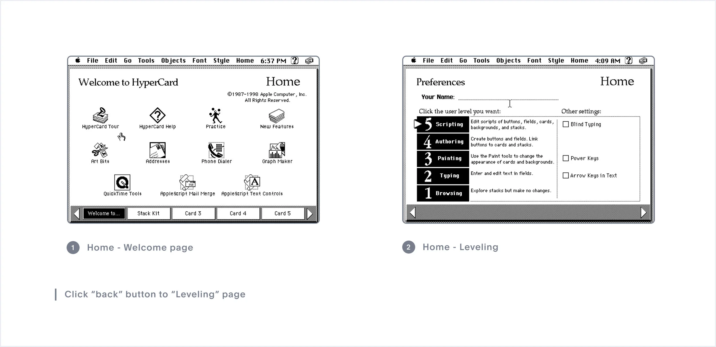
5 levels:
Level 1: Browsing, find information only; no text entry or editing
Level 2: Typing, adds text entry and editing on cards
Level 3: Painting, adds access to the Painting Tools
Level 4: Authoring, adds access to Button and Field Tools
Level 5: Scripting, adds access to HyperTalk Scripts
The Basic element

The basic building block of HyperCard is the “Card” element. The user can insert different UI elements like, buttons, images, and icons in a “Card.” A collection of cards is called a “Stack” and each card in a stack is connected.

Modern UX designers are not strangers to the idea of layers but they were a fairly new idea in the 1980s. Every UI has two views - What the author sees and What the browser sees. The browser displayed one complete page of information for viewers, but for authors, this single page is composed of different components like buttons, links, texts, etc, and each object stands a layer.

Image 1, when I chose an address card, the majority of the information is filled out by default, this is a way to onboard users by means of example. However, it is confusing because users may not know if they should overwrite the information.
Image 2, this is after I clicked “New Card,” the examples are gone and it’s clear to me that this is an empty state and I need to enter my own information.
Add a “Button”

In HyperCard, a Button is a primary navigational tool for users to browse through a stack. The user can give it different styles, with shadows, check boxes, radio buttons, rebounded corners, rectangles, etc.
An interesting fact - Did you notice the option of the button with rounded corners ? Rounded corner buttons were also developed by Bill Atkinson. Atkinson’s initial assignment was to find a way to draw a circle and oval quickly in QuickDraw. When he presented his development to his boss - Steve Jobs, Steve asked "Well, circles and ovals are good, but how about drawing rectangles with rounded corners? Can we do that now, too?" That’s the birthplace of Round Rectangles.
Link cards


In Figma, using (blue) handler to connect desired targets.
In design tools like Figma, the user can use a handler to connect elements. The user just needs to drag the handler to the desired target. But there was a different mental model in HyperCard, the user can only create the connection to the current card.
Another UX pattern which is different from today’s Mac system is the placement of the “Cancel” button. In today’s Apple Human Interface Guidelines, it is suggested to place “Cancel” button on the left side and the primary button to the right end to avoid the user accidentally pressing “Cancel”.

Put HyperCard in a bigger picture, it is a part of Apple’s move of democratizing computers, at that time computers were considered as tools for scientists. Big companies like IBM never thought about bringing computers to normal families. Through its user friendly UX and UI, Lisa, a desktop computer developed by Apple, opened up the consumer computer market. HyperCard took an even bigger step, through design, it encouraged novice users to create their own programs. Ultimately, HyperCard never seemed to have a sure-footed place in Mac’s ecosystem despite it having a big pool of fans of it’s own, by 2004 the last copy of HyperCard was sold.
HyperCard disappeared more than a decade ago, and still to this day we don't have a middle ground for normal people like artists, educators, accountants, enthusiasts to create their own applications.